In response, Itad – with our partner mWater – provided digital solutions to UNICEF East Africa Regional Office to help visualize the COVID -19 WASH response in four focus countries (Ethiopia, South Sudan, Zimbabwe and Uganda). Working with WASH Cluster leads, we took response activity data to maintain country dashboards and implemented a utility survey to capture the secondary risks posed by COVID-19 to public health across the East Africa region.
Three ways we are supporting UNICEF country offices providing WASH humanitarian assistance in East Africa:
1. Digital response monitoring and ongoing systems strengthening for future pandemics
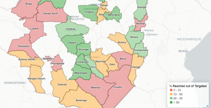
Our unique country dashboards track WASH partners’ response to COVID-19. The dashboards transformed the activity data normally compiled on excel spreadsheets into visualizations. The graphs and maps make it easier to monitor whether the sector is ‘on track’ to meet its WASH COVID-19 response targets.
In addition, the data platforms were created with WASH partners and focal persons, which helped build the skills and capacities required to unlock insights and maximize utilisation of the dashboards. The focal persons and WASH partners received full training in building, adapting, and managing the dashboards, including adding new data on a routine basis. The building of capacities future-proofs the monitoring systems as the COVID-19 pandemic unfolds and for future use.
However, the real-time reporting dashboards also highlighted that regular and routine data collection was still constrained. Partner data was not collected or submitted routinely to focal persons, meaning oftentimes the dashboards could not show up-to-date data.
2. Layering data for better insights in Ethiopia
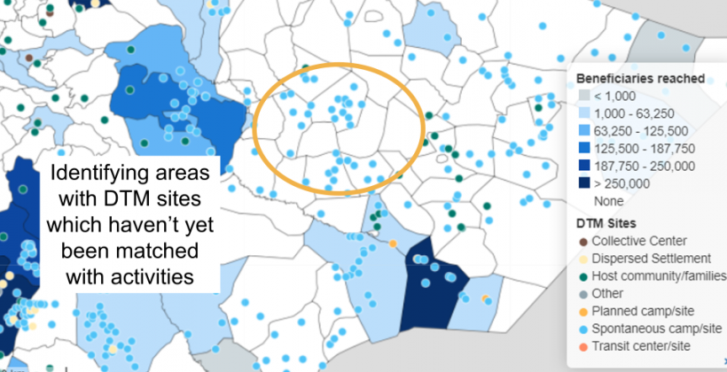
The dashboard was also used to place different datasets on top of each other to reveal new insights. In Ethiopia, we used vulnerability mapping data overlayed with information of the operational presence of and emergency response activities by cluster partners to identify where aid was needed most. For example, layering the spontaneous camps/sites over areas visualizing the total number of beneficiaries reached, helped country teams identify specific gaps and areas where WASH is needed most, as in the image below. This is a helpful visualization when presenting to key decision-makers, including government partners and donors.
3. Insights from urban water and sanitation utilities in Malawi
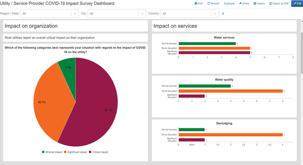
Using a rapid COVID-19 impact screening survey deployed to UNICEF offices and their service providers, our team developed internal-use dashboards to help UNICEF better understand how COVID-19 has impacted utilities and potential secondary risks.
In Malawi, 14 water service providers responded to the survey, representing 18% of the 4 million people with piped water nationally. The information reported helps the sector understand the situation ‘at a glance’. For example, most utilities reported a critical or significant impact on their organization due to the impacts of COVID-19, most notably a significant reduction in revenues combined with an increase in costs. Most providers are planning to raise tariffs to help recover losses.
The WASH sector engagement with the private water sector and urban utilities is traditionally not strong. The utility survey highlighted most countries reported little information/reporting received from utilities.
This work was part of a wider project to assess and strengthen WASH monitoring systems in East Africa. The next step to enable countries to have truly ‘real-time’ data is to link dashboards with real-time data collection tools. However, monitoring data must be designed for those that need it and use it; too much data is collected but not used as it is not accessible to the key stakeholders. Data platforms and dashboards are an effective way to overcome this challenge and make data available to those that need it.
Find out more about our work on UNICEF’s COVID-19 response here.
Eve Mackinnon – Project Manager
Petri Autio: Manager mWater
