You’ll start to see our new look across our website, social media, reports and in any communications we send to you.
New look, same passion
All brand refreshes are driven by a need for change. Our brand was last updated nearly ten years ago and it has met our needs well. But, since then, we have grown in size and ambition.
As we approach our 40th anniversary next year, we are more global than ever. We have a network of 500 trusted consultants in key locations around the world and an increased emphasis on working on global challenges with a more diverse range of clients.
We have also upped our actions on accessibility in line with our commitment to equality and inclusiveness.
Our refreshed brand better represents who we are now and what makes us special.
In updating our brand we sought to reflect:
- The complexity of the work we do and the challenges we seek to address
- The dynamic, forward-looking nature of our organisation
- Our commitment to diversity and inclusion by ensuring our fonts and colours (as well as our tone of voice) are accessible to all.
Itad’s Managing Partner, Rob Lloyd, said:
“Our refreshed identity reflects our expert, inclusive and collaborative character. It retains the essence of our focus on excellence and our unswerving commitment to support development and humanitarian organisations drive lasting social, economic and environmental change globally through our monitoring, evaluation and learning services.”
What’s changing and why?
Our updated identity includes a new definition of our logo, colours, fonts and graphics. Each has been designed to improve our brand’s accessibility, coherence and usability.
![]()
One of the first changes you may notice is our logo. The Itad ‘star’ is a symbol of excellence. Its form represents the complexity of both our work and the global challenges we seek to address.
After careful consideration, we have evolved our logo so that it is modern, simple and accessible while retaining its essence.
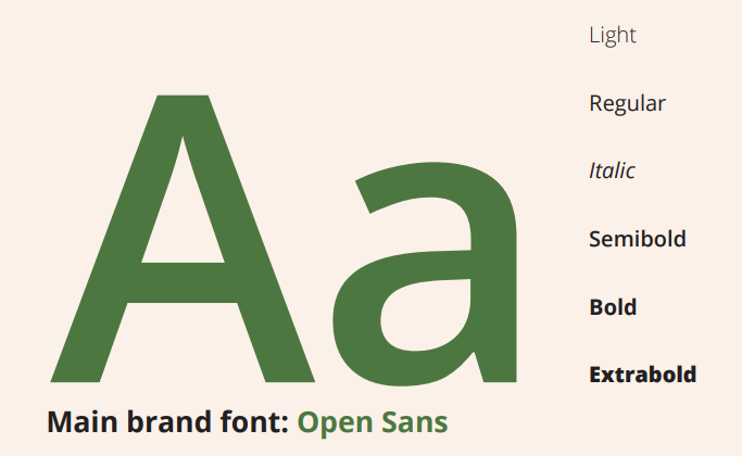
Our main fonts will be OpenSans and Grandview. These are both sans serif typefaces, optimised for print and web with excellent legible characteristics, making them fully accessible.
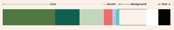
Our colour palette is a mix of vibrant and muted colours, retaining our core colour of green. The palette is made up of modern, fresh tones that look soft, inviting and rich.
What does this change mean for me?
If you are using our branding in your forthcoming project materials, we ask that you please assist us by updating them to the new brand. You can access our brand book online or get in touch with knowledgehub@itad.com if you have any questions.
Otherwise, you don’t need to do anything – just enjoy our new look!
We extend our thanks to Shape History, who partnered with us on the brand refresh project, and to Unleashed who have supported us on our journey to embed equality, diversity and inclusion in all that we do.
Related reading:
